
Managing your WordPress website
Checking how your website looks on a phone
See the page at tablet and phone size before publishing, since most visitors come from a phone.
3 steps1 minUpdated 13 November 2026
Most visitors open the website on a phone. After changing text or pictures, check how it looks on a small screen.
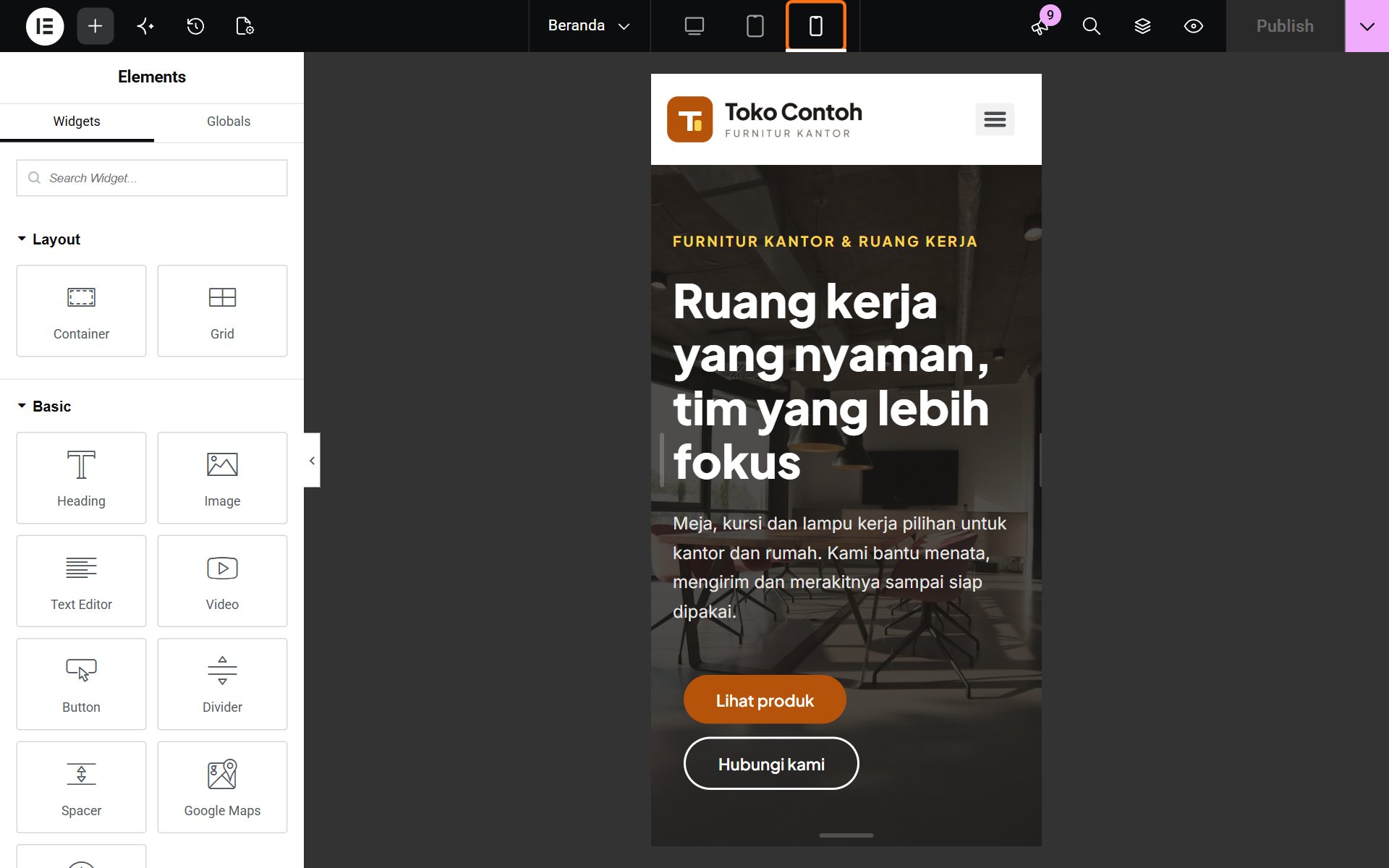
- In the Elementor editor, click the phone icon (Mobile) in the top bar. The icons next to it are for tablet and desktop.
- Scroll the page and check that text is not cut off, pictures are not too large, and buttons are easy to tap.
- Go back to the desktop view with the computer screen icon, then click Publish.
Text and picture changes apply to every screen size. If a heading is too long on a phone, choose shorter words. Phone-only size settings are best left to our team.
Was this article helpful?